What is Dynamic Symmetry?
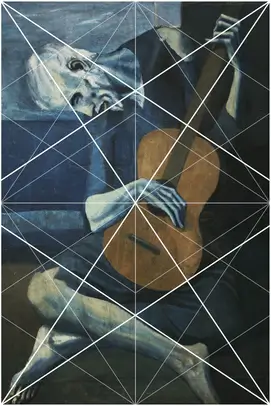
Dynamic Symmetry is said to be a compositional method or design system used by the greatest artists, from the earliest times to Da Vinci and Picasso, passed down from master to apprentice through the ages.
DS Grids
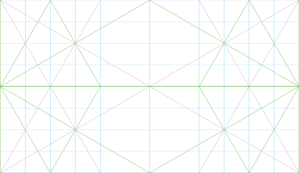
Dynamic symmetry is about proportion, between width and height. Proportional width and height produces consistent angles of the diagonals, which brings about points of intersection, from which rows and columns can be drawn, which create further points of intersection and rows and columns, and so on. They can fit into themselves, and even overlap to create further interesting dimensions! They are part of sacred geometry.
Here are the basic Dynamic Symmetry Grid ratio's, not taking into account stacking or overlapping:

5/4 : 1.25 
√Phi : 1.272 
4/3 : 1.333 
√2 : 1.414 
1.5 : 1.5 
Phi : 1.618 (Golden) 
√3 : 1.732 
√4 : 2 
√5 : 2.236 
√6 : 2.449 
√7 : 2.645 
√8 : 2.828 
√9 : 3
How can these grids be useful in web design & development?
DS grids are useful for maintaining proportions throughout a web site. They can help with design decisions such as image size choice as well as margin and padding sizes. DS columns and ratio's can be maintained with CSS.
Toggle
Note: View on desktop device.
Generally the content width of a website is limited, for example, this site's max-width is set at 80rem or about 1122px wide. Elements within this site wrapper can also have their own max-width, for example, ideal line length is about 12 words per line. Paragraphs here are set at max-width: 53ch; or 53 characters. This is maintained until the device width is smaller and then it responds appropriately. When viewing this website on top of the √3 grid, view it at desktop size and then reduce the size of the browser window to view a rotated grid for mobile view.
Proportional to device dimensions
Common laptop screen dimensions are 1366px x 768px. That's a ratio of 1.78, and the closest DS grid to that is the √3 (root 3). This then gives some proportions based on the screen dimensions.
Common mobile screen dimensions are 720px x 1280px, which is also close to √3. Proportional columns can be drawn thus:

What makes this interesting are the proportions, for example in the figure below all the rectangles are √3's:

Choosing Image Dimensions
To illustrate image dimension choice, here below is a quick overview of social media platform image dimensions (2021). Ratio calculated by dividing longer "side" by the shorter "side", closest DS grid named alongside (rotate for portrait):
| Landscape | 1.91 (± √4) | 1.90 (± √4) | 2 (√4) | 1.91 (± √4) | n/a |
| Portrait | 1.25 (± √Phi) | 1.90 (± √4) | n/a | 1.91 (± √4) | 1.5 |
| Story | 1.78 (± √3) | 1.78 (± √3) | 1.78 (± √3) | 1.78 (± √3) | 1.78 (± √3) |
| Cover | n/a | 2.7 (± √7) | 3 (± √9) | 5.91 (n/a) | n/a |
When creating images for these platforms, DS grids can be very useful. Lay information on top of the grid and see how elements line up to create a sense of balance and unity.
Other platforms aside, consistency is a golden rule in design, it allows users to find their way around without too many surprises! With DS, images are sized so that their proportions match the width of other elements on the page, even to the device itself.
Margin and padding widths can be determined and made responsive, read more here.
DS & CSS
CSS-Grid allows for control over column widths, and placing elements on the grid. For example, a √3 desktop layout can be coded as below. More granularity can be added if needed, pretty much infinitely, like a fractal.
- Code Language
- CSS
.ds-grid {
	display: grid;
	grid-template-columns: 8.4% 8.4% 8.4% 24.8% 24.8% 8.4% 8.4% 8.4%;
}


// can use instead: grid-template-columns: repeat(3, 8.4%) repeat(2, 24.8%) repeat(3, 8.4%);
Aspect Ratios
Padding-bottom on a pseudo-element trick can produce required DS ratio elements as required, here is how this can happen in HTML and CSS:
See the Pen Responsive Aspect Ratios CSS by My Urban Tribe (@MuT) on CodePen.
Conclusion
Employing tools can speed up the design process. Using dynamic symmetry in web design generates proportions that "work". It extends to working with elements at a more granular level, striving for balance, movement, flow, consistency, drawing the eye appropriately.
Discover more...
The following videos are a good place to start.